Skip to content
Contact us
CPRE in your area
Donate
What we care about
Nature and landscapes
Farming
Better places to live
Litter and recycling
Sustainable transport
Climate change and energy
Current campaigns
Our rural affordable housing campaign
Rooftop solar campaign
Hedgerows
Climate emergency
Get involved
Donations and membership
Become a member
Leave a gift in your will
Donate in memory
Partner with us
Fundraise for CPRE
Do your own fundraising
Volunteering
Find a volunteering role
Log into Volunteer Hub
Take action
Join our rural affordable housing campaign
Tell your MP to become a Rooftop Solar Champion
Sign our petition for rooftop solar
Discover our countryside
Best of the countryside
Things to do this month
About us
Who we are
Our vision
CPRE in your area
Our successes
Our achievements and history
Meet our vice presidents
Meet our trustees
What we say and do
News
Explainers
Opinion
Your stories
Countryside Voices podcast
Press and media
Policy statements and research
Resources
Reports
Guides
Consultation responses
Briefings
Maps
Forms
Light pollution and dark skies map
Planning guidance
Search for:
CPRE in your area
Donate
Contact us
What we care about
Nature and landscapes
Farming
Better places to live
Litter and recycling
Sustainable transport
Climate change and energy
Current campaigns
Our rural affordable housing campaign
Rooftop solar campaign
Hedgerows
Climate emergency
Get involved
Donations and membership
Become a member
Leave a gift in your will
Donate in memory
Partner with us
Fundraise for CPRE
Do your own fundraising
Volunteering
Find a volunteering role
Log into Volunteer Hub
Take action
Join our rural affordable housing campaign
Tell your MP to become a Rooftop Solar Champion
Sign our petition for rooftop solar
Discover our countryside
Best of the countryside
Things to do this month
About us
Who we are
Our vision
CPRE in your area
Our successes
Our achievements and history
Meet our vice presidents
Meet our trustees
What we say and do
News
Explainers
Opinion
Your stories
Countryside Voices podcast
Press and media
Policy statements and research
Resources
Reports
Guides
Consultation responses
Briefings
Maps
Forms
Light pollution and dark skies map
Planning guidance
Home
❯
What we care about
❯
Nature and landscapes
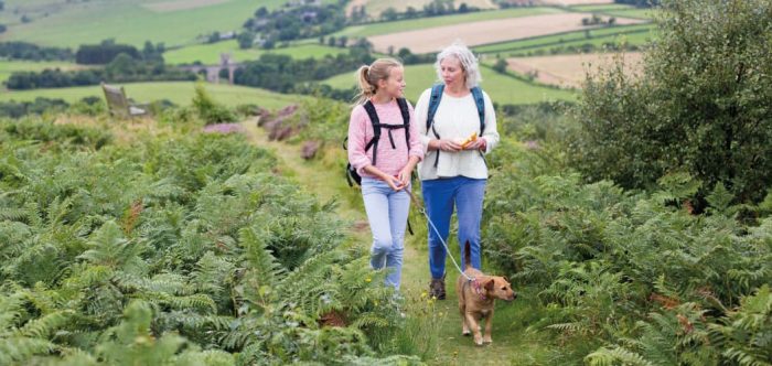
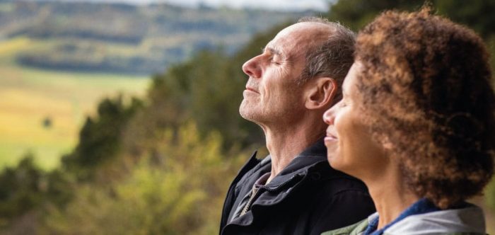
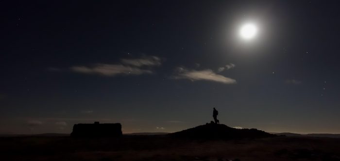
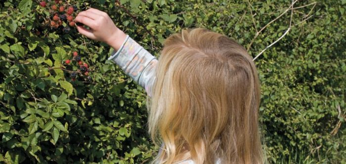
Nature and landscapes
Landscapes
Tranquil places
Dark skies
Hedgerows
Countryside for all